

Hurricane Maria: Object Detection
By: Michelle Kae Celine Jo-anne Bantugon
Business case built by
Professor Chase Kusterer
Ernst & Young | NASA (2024 EY Open Science Data Challenge)
Hult International Business School
Note: This project was a collaboration with Ella Pesola, Italo Hidalgo, Jorge Solis, Karla Marie Banal , and Marcio Pineda in the context of a Business Challenge class with Professor Chase Kusterer at Hult International Business School.
The 2024 challenge is focused on helping coastal communities become more resilient to the effects of climate change.
How can data and AI be a lifeline for a vulnerable coastline?
Video Presentation
Introduction
Located in the northeastern Caribbean, Puerto Rico is part of the “hurricane belt.” The island’s location puts it directly in the path of tropical storms and hurricanes that form in the Atlantic Ocean. Hurricane Maria made landfall in Puerto Rico in September 2017, with sustained winds as high as 155 mph, which was barely below the Category 5 threshold. This natural event caused considerable damage to the island’s infrastructure. The entire island was affected by uprooted trees, power lines pulled down, and residential and commercial roofs being destroyed. (Scott, 2018).
In line with the above, we will analyze the Normalized Difference Vegetation Index (NDVI) to evaluate the health of vegetation pre and post storm. Moreover, the use deep learning model such as YOLO (You Only Look Once) for object detection and rapid analysis to assess infrastructure damage after hurricanes will be employed. This is crucial for efficient resource allocation and effective response in disasters’ immediate aftermath. The integration of these technologies ensures that responses are more targeted and that resources are optimally used, which is crucial for areas like Puerto Rico that are frequently in the path of hurricanes.
Top Three Actionable Insights
Housing Structure
Housing structures in the Old San Juan, which is near the coastal line, are old century houses made of cobblestones or reinforced concrete with either flat roofs and or shingle roofings. The buildings were also erected near each other making them sturdier rather than stand-alone houses or buildings. While the most damaged areas by hurricane happened in rural areas where houses or buildings are more scattered, stand-alone and mostly made out of lightweight materials.
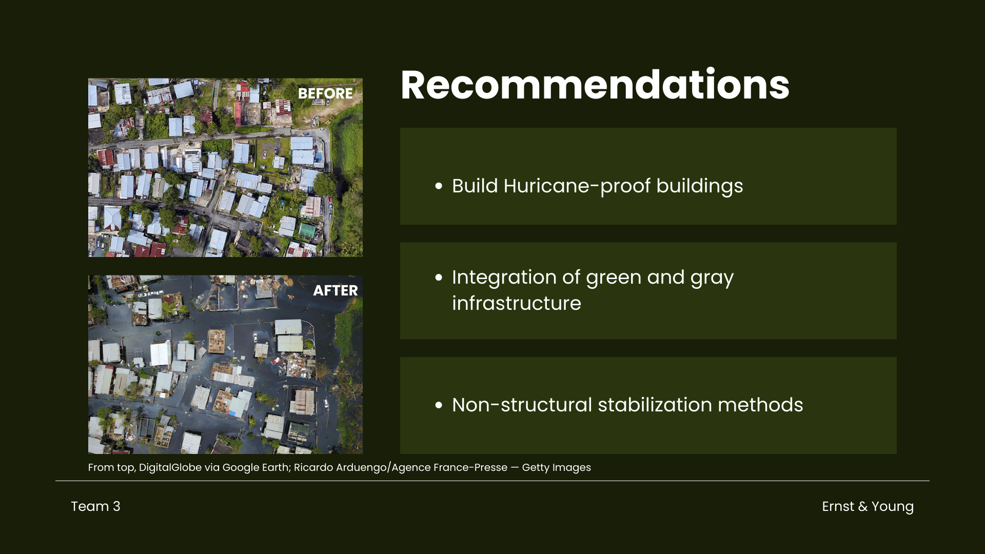
One way to lessen the effect of hurricanes on buildings, be it commercial or residential is by getting people to build more hurricane-proof buildings especially in the rural areas. Based on the outreach project initiated by the Federal Emergency Management Agency (FEMA) in conjunction with the Federal Alliance for Safe homes (FLASH), strong implementation of the use of materials based on ICC standards will surely make a lot of difference. The houses, especially the older homes must ensure roof coverings are high wind-rated and attached properly regardless of the type (tiles, shingles, or metal). It is also highly recommended to install permanently-mounted hurricane shutters, strengthen the roof deck connection, and strengthen roof-to-wall connections by installing hurricane clips or straps. Lastly install a secondary water barrier and improve the anchorage of attached structures.
Integration of green and gray infrastructure (embankments/seawalls) with natural coastal habitats
The pronounced change in NDVI in vegetation forests indicates heavy damage, highlighting the potential integration of natural coastal habitats such as mangrove forests, reefs, seagrass, or salt marshes into coastal defense strategies. These natural habitats can break tidal waves, reduce storm and erosion risks, and contribute to maintaining land as sea levels rise.
Non-structural stabilization methods
Given the increased vulnerability of coastal areas to infrastructure damage, implementing both structural and non-structural measures is crucial. Structural protection, such as coastal habitats, can mitigate damage. Additionally, non-structural methods like beach nourishment and dune restoration offer effective solutions. Beach nourishment involves adding sand or sediment that widens the beach, reducing storm damage, while dune restoration involves rebuilding dunes and planting native vegetation to stabilize them, trap sand, and enhance coastal habitat.
Another approach is living shorelines, which use vegetation such as oyster reefs, seagrasses, mangroves, and vegetated dunes. These features can calm waves, reduce wave energy, and stabilize the coastline.
Part I. Importing Packages
# supress warnings (be careful while using this)
import warnings
warnings.filterwarnings('ignore')

import pandas as pd

# import common GIS tools
import numpy                   as np
import xarray                  as xr
import matplotlib.pyplot       as plt
import rasterio.features
import rioxarray               as rio
from matplotlib.cm import RdYlGn, Reds

# import Planetary Computer tools
import pystac_client
import planetary_computer as pc
import odc
from odc.stac import stac_load

# additional libraries
from datetime import date # date-related calculations

# GeoTiff images
import rasterio
from   osgeo import gdal

# data visualisation
from   matplotlib        import pyplot as plt
from   matplotlib.pyplot import figure
import matplotlib.image  as img
from   PIL               import Image
import seaborn as sns

# model building
import ultralytics
from   ultralytics import YOLO
import labelme2yolo

# others
import os
import shutil
import zipfile
Part II. Pre- and Post-Event NDVI Analysis
Part I utilizes the NDVI to calculate changes in vegetation. This calculation is based on Sentinel-2 optical data and the goal is to identify areas where storms have damaged vegetation and to assess if there is significant damage to buildings in nearby regions. The process involves defining the area of interest, the time period before and after the storm, the level of detail in the imagery (30 meters for Landstat), and filtering out the clouds . Same procedures were followed in the three visualizations below, resulting in identical outputs.
Visualization 01
Accessing Satellite Data
## Hurricane Maria - San Juan, Puerto Rico ##

## Defining the area of interest using latitude and longitude coordinates
## at the center of the area we would like to observe

# Define the bounding box for the selected region
min_lon = -66.19385887
min_lat =  18.27306794
max_lon = -66.069299
max_lat =  18.400288

# setting geographic boundary
bounds = (min_lon, min_lat, max_lon, max_lat)

# setting time window surrounding the storm landfall on September 20, 2017
time_window = "2017-04-08/2017-10-31"

# calculating days in time window
print(date(2017, 10, 31) - date(2017, 4, 8 ))
206 days, 0:00:00
## Using Planetary Computer's STAC catalog for items matching our query parameters above

# connecting to the planetary computer
stac = pystac_client.Client.open("https://planetarycomputer.microsoft.com/api/stac/v1")

# seaching for data
search = stac.search(collections = ["sentinel-2-l2a"],
                     bbox        = bounds,
                     datetime    = time_window)

# instantiating results list
items = list(search.get_all_items())

# summarizing results
print('This is the number of scenes that touch our region:',len(items))
This is the number of scenes that touch our region: 63
## Setting the resolution to 10 meters per pixel, and then convert this to degrees per pixel for the
## latitude-longitude coordinate system

# pixel resolution for the final product
resolution = 10  # meters per pixel


# scaling to degrees per pizel
scale = resolution / 111320.0 # degrees per pixel for CRS:4326
## Use of Open Data Cube (ODC) for managing and analyzing geospatial data
## loading specific bands of data (like red, green, blue, near-infrared, and SCL)
## Filtering out clouds using the qa_pixel band and mapping at a resolution of 30 meters per pixel

xx = stac_load(
    items,
    bands      = ["red", "green", "blue", "nir", "SCL"],
    crs        = "EPSG:4326",                            # latitude-longitude
    resolution = scale,                                  # degrees
    chunks     = {"x": 2048, "y": 2048},
    dtype      = "uint16",
    patch_url  = pc.sign,
    bbox       = bounds
)
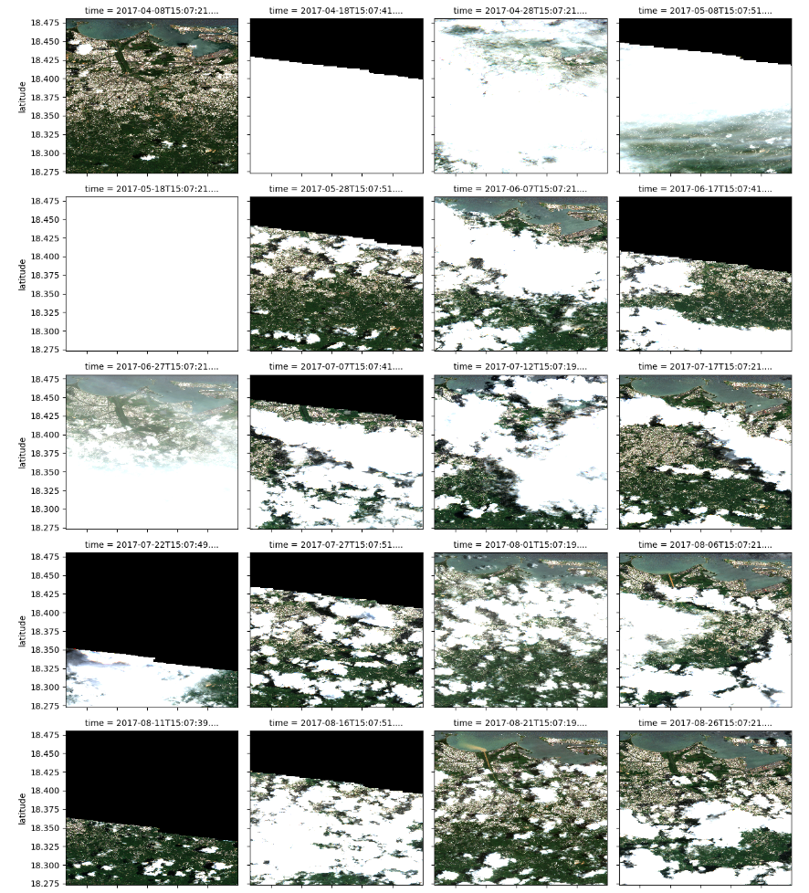
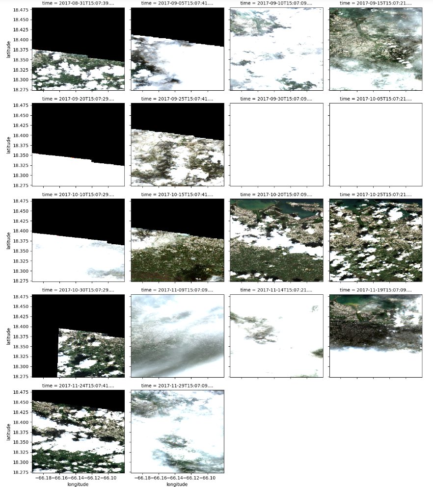
Viewing RGB (real color) images from the time series
# This will take some time to run

# subsetting results for RGB
plot_xx = xx[ ["red", "green", "blue"] ].to_array()


# showing results
plot_xx.plot.imshow(col      = 'time', # time
                    col_wrap = 4     , # four columns per row
                    robust   = True  ,
                    vmin     = 0     ,
                    vmax     = 3000  )


# rendering results
plt.show()
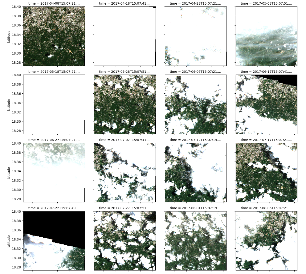
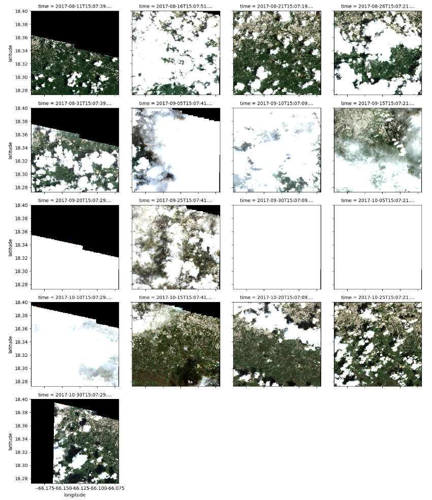
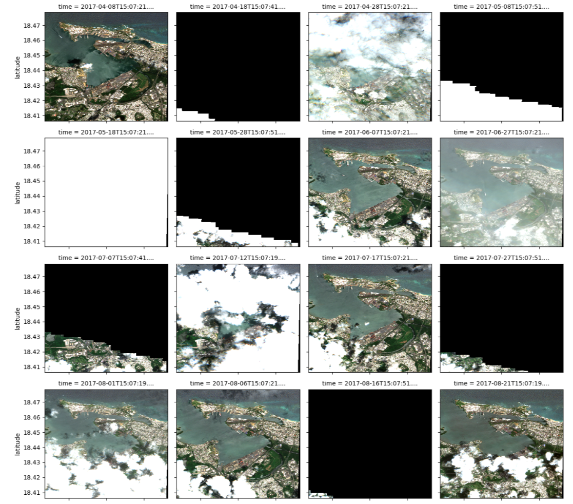
This focuses on the lower part of San Juan where forests are prominent. It includes geographic area and time frame, relevant satellite data and various angles. Visualization aids in selecting clear satellite images, enabling assessment of the most damaged areas by comparing pre- and post-storm dates. It also helps in narrowing the time window to assess the extent of damage post-storm. A good pre- and post-storm image should have minimal cloud cover and a suitable angle for assessing NDVI changes.
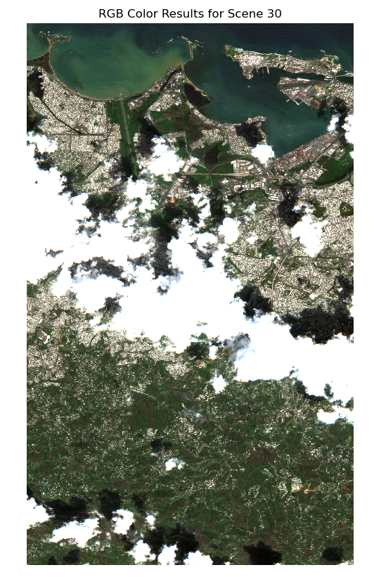
# selecting a selected time slice to view a single RGB image and the cloud mask
time_slice = 29 # October 20, 2017 (post-storm)
## plotting an RGB real color image for a single date ##

# setting plot size
fig, ax = plt.subplots( figsize = (6, 10) )


# preparing the plot
xx.isel(time = time_slice)[ ["red", "green", "blue"] ].\
    to_array().plot.imshow(robust = True,
                           ax     = ax  ,
                           vmin   = 0   ,
                           vmax   = 3000)


# titles and axis lables
ax.set_title(label = f"RGB Color Results for Scene {time_slice}")
ax.axis('off')


# rendering results
plt.show()
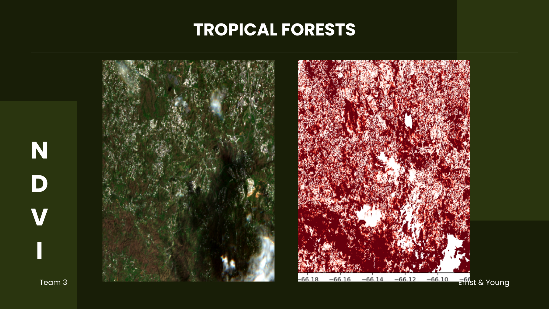
This area of interest includes tropical forests and vegetation, some of which are located near Cupey and Caimito,
in the lower part of San Juan. These were significantly impacted as evidenced by the browning of vegetation.
According to NASA, nearly 60% of canopy trees in the region lost branches, snapped in half, or uprooted, with
trees that once had wide, spreading crowns now reduced to slender main trunks. Forests in Puerto Rico are now
approximately one-third shorter on average following Hurricane Maria (NASA, 2019).
Applying Cloud Filtering and Masking
# instantiating a colormap for SCL pixel classifications

scl_colormap = np.array(
    [
        [252,  40, 228, 255],  # 0  - NODATA - MAGENTA
        [255,   0,   4, 255],  # 1  - Saturated or Defective - RED
        [0  ,   0,   0, 255],  # 2  - Dark Areas - BLACK
        [97 ,  97,  97, 255],  # 3  - Cloud Shadow - DARK GREY
        [3  , 139,  80, 255],  # 4  - Vegetation - GREEN
        [192, 132,  12, 255],  # 5  - Bare Ground - BROWN
        [21 , 103, 141, 255],  # 6  - Water - BLUE
        [117,   0,  27, 255],  # 7  - Unclassified - MAROON
        [208, 208, 208, 255],  # 8  - Cloud - LIGHT GREY
        [244, 244, 244, 255],  # 9  - Definitely Cloud - WHITE
        [195, 231, 240, 255],  # 10 - Thin Cloud - LIGHT BLUE
        [222, 157, 204, 255],  # 11 - Snow or Ice - PINK
    ],
    dtype="uint8",
)
# function for color encoding
def colorize(xx, colormap):
    return xr.DataArray( colormap[xx.data],
                         coords = xx.coords,
                         dims   = (*xx.dims, "band") )
# filtering out water, etc.
filter_values = [0, 1, 3, 6, 8, 9, 10]

cloud_mask = ~xx.SCL.isin(filter_values) # this means not in filter_values
# appling cloud mask (filtering out clouds, cloud shadows, and water)

# storing as 16-bit integers
cleaned_data = xx.where(cloud_mask).astype("uint16")
# converting SCL to RGB
scl_rgba_clean = colorize(xx = cleaned_data.isel(time = time_slice).SCL.compute(),
colormap = scl_colormap)
# setting figure size
plt.figure(figsize = (6, 10))
plt.imshow(scl_rgba_clean)
# titles and axis labels
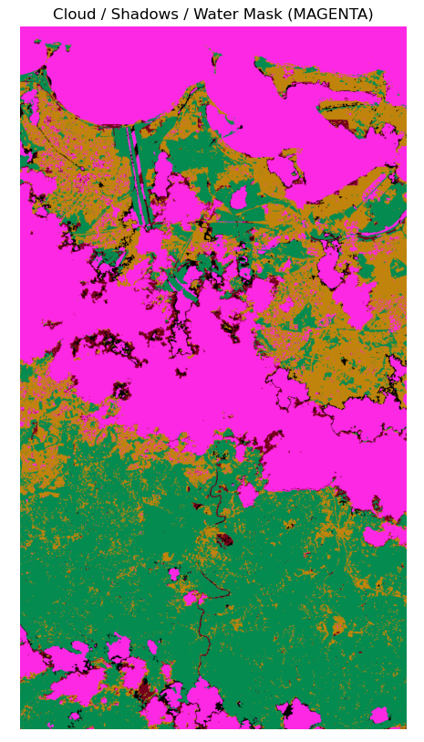
plt.title(label = "Cloud / Shadows / Water Mask (MAGENTA)")
plt.axis('off')
# rendering the plot
plt.show()
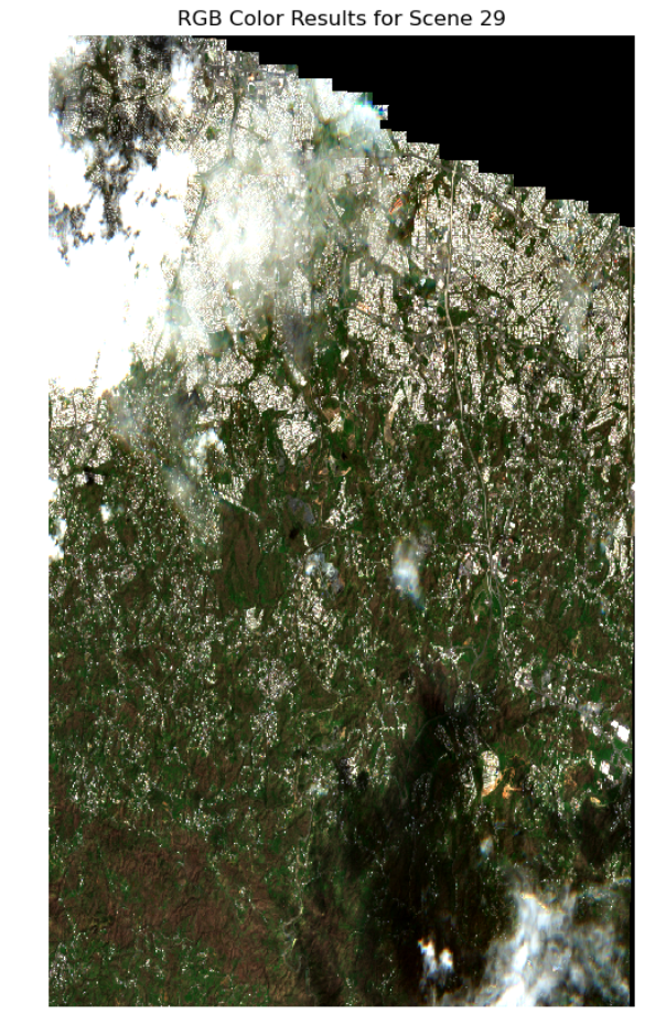
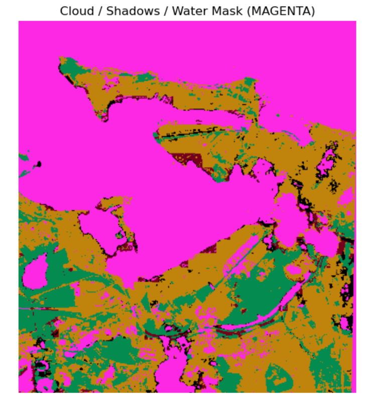
Code above creates a colormap for different land cover types based on Sentinel-2 Scene Classification Layer (SCL)
values. It then applies the colormap to the data, highlighting vegetation, bare ground, and water in distinct colors.
It filters out clouds, cloud shadows, and no data from the image represented by the magenta color, displaying the remaining land cover types in the area of interest.
Normalized Difference Vegetation Index (NDVI)
# preparing two time steps compare NDVI outputs
first_time  = 0  # April 08, 2017
second_time = 29 # October 20, 2017
# setting figure size
fig, ax = plt.subplots(1, 2, figsize = (15, 10))


# first image data
ndvi_image = (cleaned_data.nir - cleaned_data.red) / (cleaned_data.nir + cleaned_data.red)
ndvi_image.isel(time = first_time ).plot(ax = ax[0],
                                         vmin = 0.0,
                                         vmax = 0.8,
                                         cmap = "RdYlGn")


# second image data
ndvi_image.isel(time = second_time).plot(ax = ax[1],
                                         vmin = 0.0,
                                         vmax = 0.8,
                                         cmap = "RdYlGn")


# axis labels
ax[0].set_title(label = 'NDVI-Time #1'), ax[0].xaxis.set_visible(False), ax[0].yaxis.set_visible(False)
ax[1].set_title(label = 'NDVI-Time #2'), ax[1].xaxis.set_visible(False), ax[1].yaxis.set_visible(False)

# rendering the plot
plt.show()
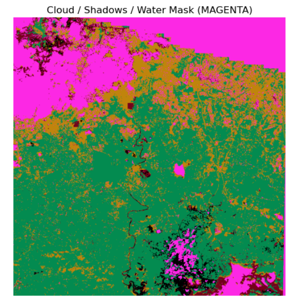
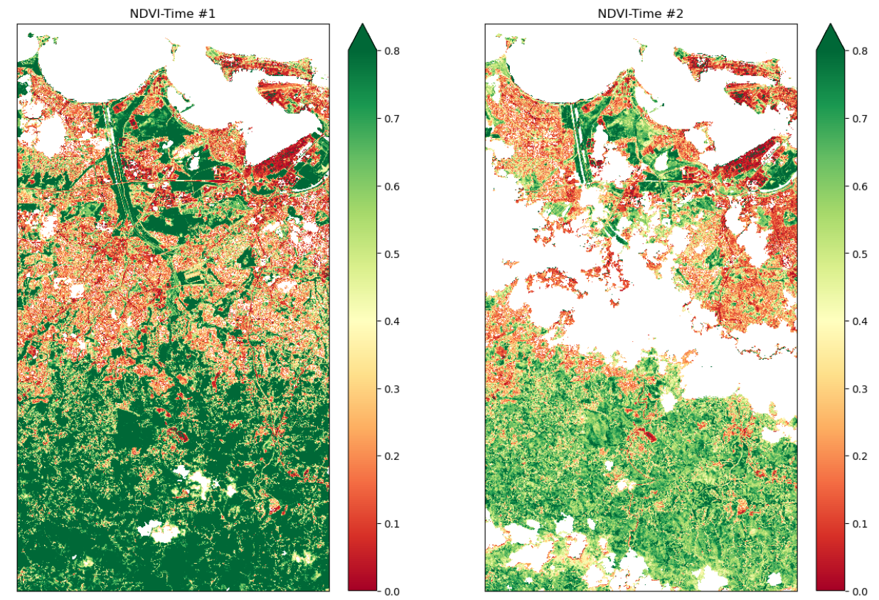
The figure is from April 08 and October 20, 2017. It creates plots of NDVI values for selected time window,
masking out clouds, shadows, and no data. Values indicate the health and density of vegetation, with higher
values typically indicating healthier vegetation (dark green). Moreover, it illustrates how vegetation cover
changed post-storm, evident in the shift to lighter green, red, and orange shades, providing insights into the
sudden drop in NDVI after the storm.
NDVI Change Product
# function for calculating NDVI anomalies
def NDVI(dataset):
    return (dataset.nir - dataset.red) / (dataset.nir + dataset.red)
# running comparison
ndvi_clean = NDVI(cleaned_data)

# calculating difference
ndvi_pre     = ndvi_clean.isel(time = first_time)
ndvi_post    = ndvi_clean.isel(time = second_time)
ndvi_anomaly = ndvi_post - ndvi_pre


# all areas of water or clouds will be black
RdYlGn.set_bad('black',1.)


# reversing the colormap for reds
Reds_reverse = "Reds_r"
## plotting NDVI anomaly
plt.figure( figsize = (6,10) )
ndvi_anomaly.plot(vmin = -0.2, vmax=0.0, cmap = Reds_reverse, add_colorbar=False)


# titles and labels
plt.title (label  = "NDVI Anomaly")
plt.xlabel(xlabel = "Longitude")
plt.ylabel(ylabel = "Latitude")

# Save the current figure as a variable
ndvi_plot_01 = plt.gcf()

# Display the plot
plt.show()
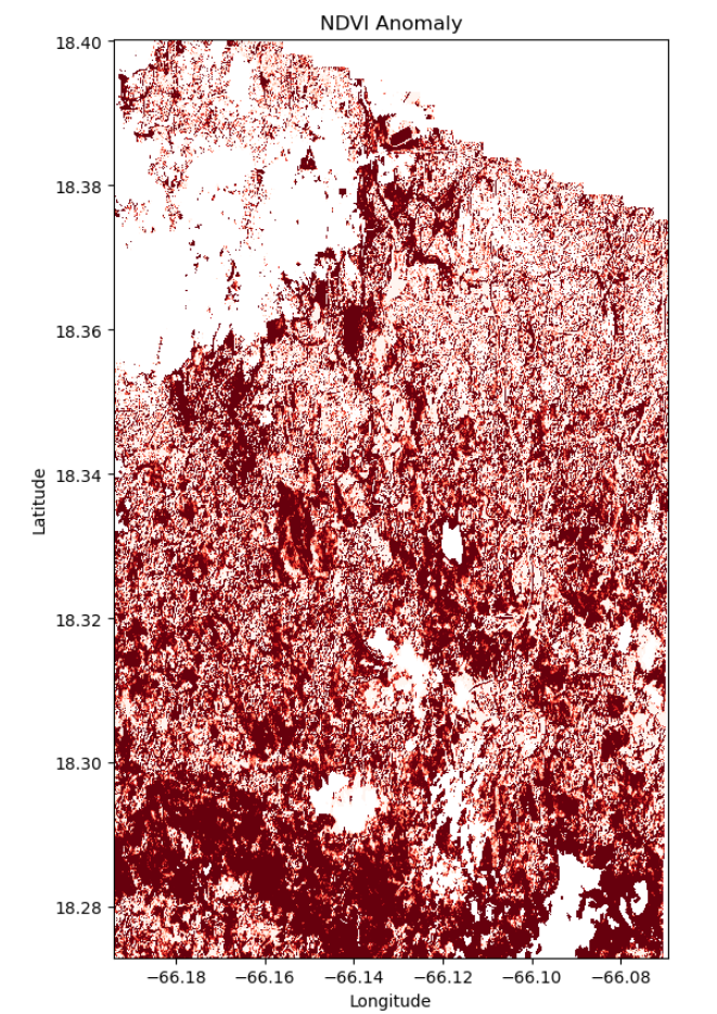
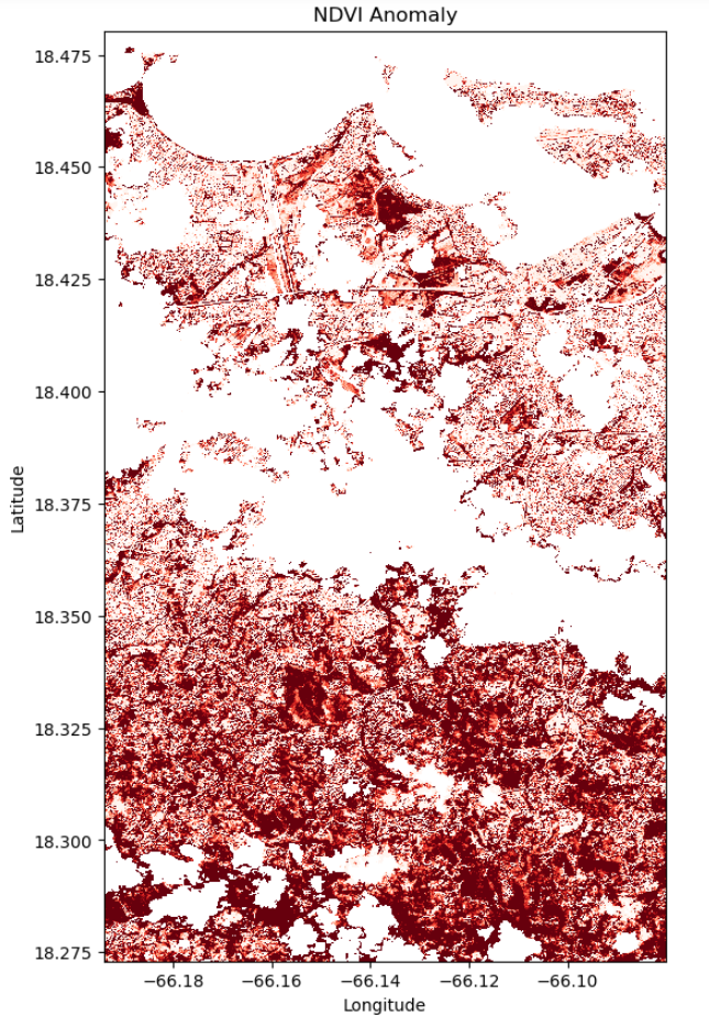
Analysis (Visualization 01)
The forest area shows varying degrees of vegetation change after Hurricane María. The darker red regions indicate severe damage, likely due to high winds, tree fall, and extensive defoliation. Lighter red areas suggest moderate stress or partial vegetation loss, with potential for quicker recovery. Factors contributing to this varied impact include the storm’s path and intensity, topography, forest composition, and proximity to urban infrastructure. These variations underscore the need for targeted recovery efforts, focused reforestation, and comprehensive disaster preparedness strategies in forested regions prone to hurricanes.
Visualization 02
Accessing Satellite Data
# Define the bounding box for the selected region
min_lon = -66.19385887
min_lat =  18.27306794
max_lon = -66.08007533
max_lat =  18.48024350

# setting geographic boundary
bounds = (min_lon, min_lat, max_lon, max_lat)


# setting time window surrounding the storm landfall on September 20, 2017
time_window = "2017-04-08/2017-11-30"

# calculating days in time window
print(date(2017, 11, 1) - date(2017, 4, 1 ))
214 days, 0:00:00
## Using Planetary Computer's STAC catalog for items matching our query parameters above

# connecting to the planetary computer
stac = pystac_client.Client.open("https://planetarycomputer.microsoft.com/api/stac/v1")


# seaching for data
search = stac.search(collections = ["sentinel-2-l2a"],
                     bbox        = bounds,
                     datetime    = time_window)


# instantiating results list
items = list(search.get_all_items())


# summarizing results
print('This is the number of scenes that touch our region:',len(items))
This is the number of scenes that touch our region: 73
## Setting the resolution to 10 meters per pixel, and then convert this to degrees per pixel for the
## latitude-longitude coordinate system

# pixel resolution for the final product
resolution = 10  # meters per pixel


# scaling to degrees per pizel
scale = resolution / 111320.0 # degrees per pixel for CRS:4326
## Use of Open Data Cube (ODC) for managing and analyzing geospatial data
## loading specific bands of data (like red, green, blue, near-infrared, and SCL)
## Filtering out clouds using the qa_pixel band and mapping at a resolution of 30 meters per pixel

xx = stac_load(
    items,
    bands      = ["red", "green", "blue", "nir", "SCL"],
    crs        = "EPSG:4326",                            # latitude-longitude
    resolution = scale,                                  # degrees
    chunks     = {"x": 2048, "y": 2048},
    dtype      = "uint16",
    patch_url  = pc.sign,
    bbox       = bounds
)
Viewing RGB (real color) images from the time series
# Putting into comments since it will take some time to run

# subsetting results for RGB
plot_xx = xx[ ["red", "green", "blue"] ].to_array()


# showing results
plot_xx.plot.imshow(col      = 'time', # time
                    col_wrap = 4     , # four columns per row
                    robust   = True  ,
                    vmin     = 0     ,
                    vmax     = 3000  )


# rendering results
plt.show()
This visual focuses in the middle part where houses are located near forested areas. Geographic area and
time frame, relevant satellite data, and various angles were displayed. Visualizations have more clouds
and not a good angle, usually either cropped or not captured at all. Zooming in on the area was done to
assess the extent of damage. Same pre- and post-dates were chosen for consistency in assessing damage only
varying the coordinates.
# selecting a selected time slice to view a single RGB image and the cloud mask
time_slice = 30 # October 20, 2017 (post storm)
## plotting an RGB real color image for a single date ##

# setting plot size
fig, ax = plt.subplots( figsize = (6, 10) )


# preparing the plot
xx.isel(time = time_slice)[ ["red", "green", "blue"] ].\
    to_array().plot.imshow(robust = True,
                           ax     = ax  ,
                           vmin   = 0   ,
                           vmax   = 3000)


# titles and axis lables
ax.set_title(label = f"RGB Color Results for Scene {time_slice}")
ax.axis('off')


# rendering results
plt.show()
The highlighted area of interest includes tropical forests, vegetation, and surrounding suburbs, indicated by
white tones. Notably, there is observable browning of vegetation near forested regions, suburbs, and infrastructure
along the coastal areas. These findings align with Hosannah, N. et al. (2019), who noted a significant increase in
barren and pasture land cover post-storm, with forest cover being converted to bare soil (13%–41%) or pasture in
both forested areas and suburbs.
Applying Cloud Filtering and Masking
# filtering out water, etc.
filter_values = [0, 1, 3, 6, 8, 9, 10]

cloud_mask = ~xx.SCL.isin(filter_values) # this means not in filter_values
# appling cloud mask (filtering out clouds, cloud shadows, and water)

# storing as 16-bit integers
cleaned_data = xx.where(cloud_mask).astype("uint16")
# Putting into comments; same code as Viz 1

# converting SCL to RGB
scl_rgba_clean = colorize(xx       = cleaned_data.isel(time = time_slice).SCL.compute(),
                          colormap = scl_colormap)


# setting figure size
plt.figure(figsize = (6, 10))
plt.imshow(scl_rgba_clean)


# titles and axis labels
plt.title(label = "Cloud / Shadows / Water Mask (MAGENTA)")
plt.axis('off')


# rendering the plot
plt.show()
Normalized Difference Vegetation Index (NDVI)
# preparing two time steps compare NDVI outputs
first_time  = 0  # April 08, 2017
second_time = 30 # October 20, 2017
# Putting into comments; same code as Viz 1

# Plots of NDVI at two different time slices
# Clouds, Shadows and Water are masked

# setting figure size
fig, ax = plt.subplots(1, 2, figsize = (15, 10))


# first image data
ndvi_image = (cleaned_data.nir - cleaned_data.red) / (cleaned_data.nir + cleaned_data.red)
ndvi_image.isel(time = first_time ).plot(ax = ax[0],
                                         vmin = 0.0,
                                         vmax = 0.8,
                                         cmap = "RdYlGn")


# second image data
ndvi_image.isel(time = second_time).plot(ax = ax[1],
                                         vmin = 0.0,
                                         vmax = 0.8,
                                         cmap = "RdYlGn")


# axis labels
ax[0].set_title(label = 'NDVI-Time #1'), ax[0].xaxis.set_visible(False), ax[0].yaxis.set_visible(False)
ax[1].set_title(label = 'NDVI-Time #2'), ax[1].xaxis.set_visible(False), ax[1].yaxis.set_visible(False)

# rendering the plot
plt.show()
NDVI Change Product
# running comparison
ndvi_clean = NDVI(cleaned_data)

# calculating difference
ndvi_pre     = ndvi_clean.isel(time = first_time)
ndvi_post    = ndvi_clean.isel(time = second_time)
ndvi_anomaly = ndvi_post - ndvi_pre


# all areas of water or clouds will be black
RdYlGn.set_bad('black',1.)


# reversing the colormap for reds
Reds_reverse = "Reds_r"
## plotting NDVI anomaly
plt.figure( figsize = (6,10) )
ndvi_anomaly.plot(vmin = -0.2, vmax=0.0, cmap = Reds_reverse, add_colorbar=False)


# titles and labels
plt.title (label  = "NDVI Anomaly")
plt.xlabel(xlabel = "Longitude")
plt.ylabel(ylabel = "Latitude")

# Save the current figure as a variable
ndvi_plot_02 = plt.gcf()

# Display the plot
plt.show()
Analysis (Visualization 02)
The dark red zones reflect acute vegetative destruction, hinting at the harsh conditions endured. Lighter reds and pinks signal less impacted areas that might recover more quickly, contingent on suitable soil and root health. White and pale zones likely represent non-vegetative or data-compromised areas and thus do not inform on vegetation status. The disparity in damage levels, potentially due to topography, land cover, and the storm’s path, underscores the need for pinpointed restoration efforts and ongoing ecological tracking.
Visualization 03
Accessing Satellite Data
# Define the bounding box for the selected region
min_lon = -66.1327369
min_lat =  18.4063942
max_lon = -66.0673603
max_lat =  18.4784524


# setting geographic boundary
bounds = (min_lon, min_lat, max_lon, max_lat)


# setting time window surrounding the storm landfall on September 20, 2017
time_window = "2017-04-01/2017-11-01"

# calculating days in time window
print(date(2017, 11, 1) - date(2017, 4, 1 ))
214 days, 0:00:00
## Using Planetary Computer's STAC catalog for items matching our query parameters above

# connecting to the planetary computer
stac = pystac_client.Client.open("https://planetarycomputer.microsoft.com/api/stac/v1")


# seaching for data
search = stac.search(collections = ["sentinel-2-l2a"],
                     bbox        = bounds,
                     datetime    = time_window)


# instantiating results list
items = list(search.get_all_items())


# summarizing results
print('This is the number of scenes that touch our region:',len(items))
This is the number of scenes that touch our region: 45
## Setting the resolution to 10 meters per pixel, and then convert this to degrees per pixel for the
## latitude-longitude coordinate system

# pixel resolution for the final product
resolution = 10  # meters per pixel


# scaling to degrees per pizel
scale = resolution / 111320.0 # degrees per pixel for CRS:4326
## Use of Open Data Cube (ODC) for managing and analyzing geospatial data
## loading specific bands of data (like red, green, blue, near-infrared, and SCL)
## Filtering out clouds using the qa_pixel band and mapping at a resolution of 30 meters per pixel

xx = stac_load(
    items,
    bands      = ["red", "green", "blue", "nir", "SCL"],
    crs        = "EPSG:4326",                            # latitude-longitude
    resolution = scale,                                  # degrees
    chunks     = {"x": 2048, "y": 2048},
    dtype      = "uint16",
    patch_url  = pc.sign,
    bbox       = bounds
)
Viewing RGB (real color) images from the time series
# Putting into comments since it will take some time to run

# subsetting results for RGB
plot_xx = xx[ ["red", "green", "blue"] ].to_array()


# showing results
plot_xx.plot.imshow(col      = 'time', # time
                    col_wrap = 4     , # four columns per row
                    robust   = True  ,
                    vmin     = 0     ,
                    vmax     = 3000  )


# rendering results
plt.show()
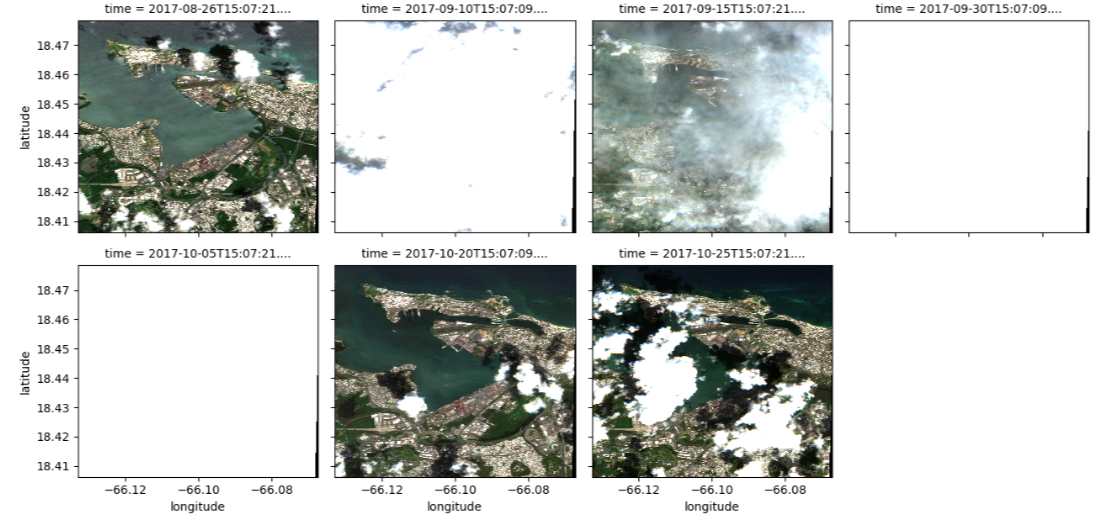
This visualization targets an area in northern San Juan, Puerto Rico, featuring critical infrastructure near coastal regions. It defines a specific geographical area and time range and collects pertinent satellite data. However, many visualizations are obscured by clouds, and some lack data entirely. To evaluate damage, we zoomed into the area, maintaining consistent pre- and post-dates while varying coordinates to assess damage extent in this area.
# selecting a selected time slice to view a single RGB image and the cloud mask
time_slice = 21 # October 20, 2017 (post storm)
## plotting an RGB real color image for a single date ##

# setting plot size
fig, ax = plt.subplots( figsize = (6, 10) )


# preparing the plot
xx.isel(time = time_slice)[ ["red", "green", "blue"] ].\
    to_array().plot.imshow(robust = True,

                           ax     = ax  ,
                           vmin   = 0   ,
                           vmax   = 3000)


# titles and axis lables
ax.set_title(label = f"RGB Color Results for Scene {time_slice}")
ax.axis('off')


# rendering results
plt.show()
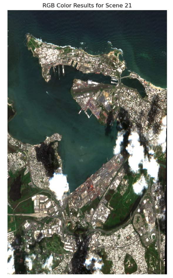
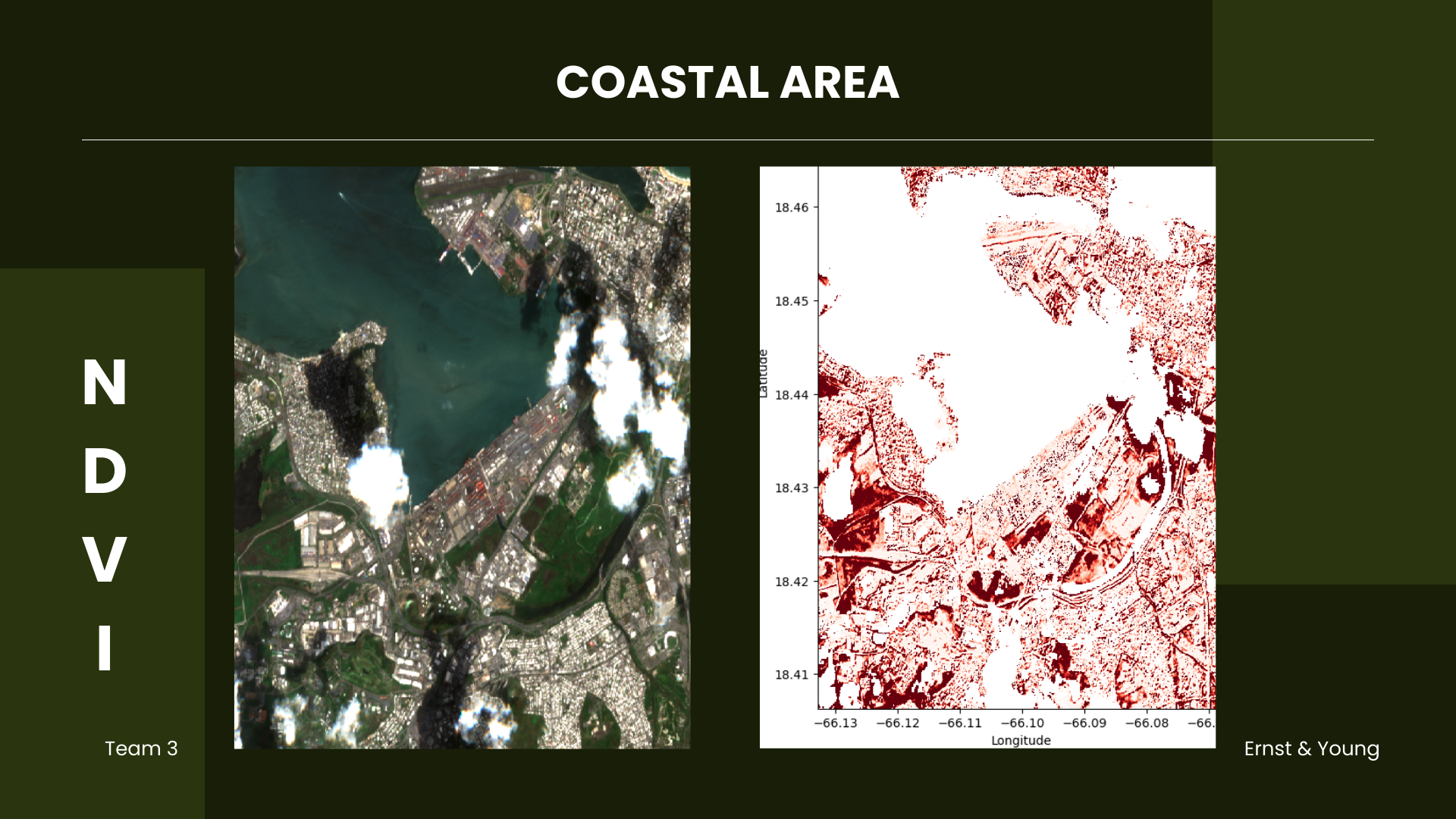
It is evident that vegetation near coastal infrastructures has also shown signs of browning. This indicates
potential damage to houses and buildings. This image can help identify the specific types of buildings,
critical infrastructures, and areas most affected by the storm. Moreover, beach erosion and its significant
impact on coastal vulnerability can be assessed, as studied by Valentin & Muller (2020), who found an average
beach loss of 3 to 5 meters along the hurricane’s path and up to 40 meters at certain beaches.
Applying Cloud Filtering and Masking
# filtering out water, etc.
filter_values = [0, 1, 3, 6, 8, 9, 10]

cloud_mask = ~xx.SCL.isin(filter_values) # this means not in filter_values
# appling cloud mask (filtering out clouds, cloud shadows, and water)

# storing as 16-bit integers
cleaned_data = xx.where(cloud_mask).astype("uint16")
# Putting into comments; same code as Viz 1/2

# converting SCL to RGB
scl_rgba_clean = colorize(xx       = cleaned_data.isel(time = time_slice).SCL.compute(),
                          colormap = scl_colormap)


# setting figure size
plt.figure(figsize = (6, 10))
plt.imshow(scl_rgba_clean)


# titles and axis labels
plt.title(label = "Cloud / Shadows / Water Mask (MAGENTA)")
plt.axis('off')


# rendering the plot
plt.show()
Normalized Difference Vegetation Index (NDVI)
# preparing two time steps compare NDVI outputs
first_time  = 0  # April 08, 2017
second_time = 21 # October 20, 2017
# Putting into comments; same code as Viz 1/2

# Plots of NDVI at two different time slices
# Clouds, Shadows and Water are masked

# setting figure size
fig, ax = plt.subplots(1, 2, figsize = (15, 10))


# first image data
ndvi_image = (cleaned_data.nir - cleaned_data.red) / (cleaned_data.nir + cleaned_data.red)
ndvi_image.isel(time = first_time ).plot(ax = ax[0],
                                         vmin = 0.0,
                                         vmax = 0.8,
                                         cmap = "RdYlGn")


# second image data
ndvi_image.isel(time = second_time).plot(ax = ax[1],
                                         vmin = 0.0,
                                         vmax = 0.8,
                                         cmap = "RdYlGn")


# axis labels
ax[0].set_title(label = 'NDVI-Time #1'), ax[0].xaxis.set_visible(False), ax[0].yaxis.set_visible(False)
ax[1].set_title(label = 'NDVI-Time #2'), ax[1].xaxis.set_visible(False), ax[1].yaxis.set_visible(False)

# rendering the plot
plt.show()
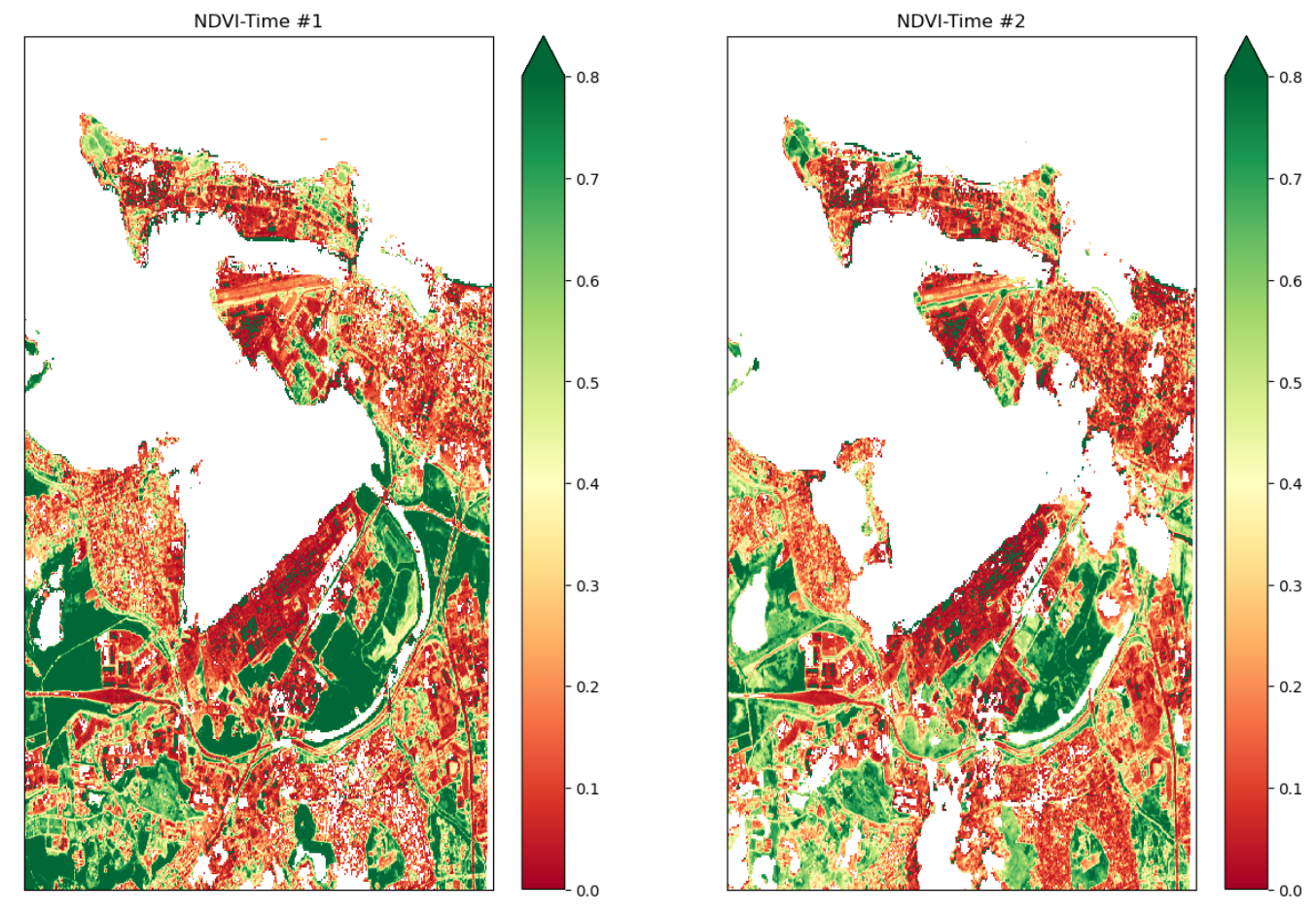
Using the same time window as before, this visualization generates plots of NDVI values while excluding clouds,
shadows, water, and dark areas near the coastal area. NDVI values indicate vegetation health and density, with
higher values suggesting healthier vegetation (dark green). The plots demonstrate changes in vegetation cover
following the storm near Guaynabo, Puerto Nuevo, and Catano, among others, highlighting shifts to lighter green,
red, yellow, and orange shades in forested, suburban, and coastal regions. These changes provide valuable insights
into the sudden decline in NDVI post-storm.
NDVI Change Product
# running comparison
ndvi_clean = NDVI(cleaned_data)

# calculating difference
ndvi_pre     = ndvi_clean.isel(time = first_time)
ndvi_post    = ndvi_clean.isel(time = second_time)
ndvi_anomaly = ndvi_post - ndvi_pre


# all areas of water or clouds will be black
RdYlGn.set_bad('black',1.)


# reversing the colormap for reds
Reds_reverse = "Reds_r"
## plotting NDVI anomaly
plt.figure( figsize = (6,10) )
ndvi_anomaly.plot(vmin = -0.2, vmax=0.0, cmap = Reds_reverse, add_colorbar=False)


# titles and labels
plt.title (label  = "NDVI Anomaly")
plt.xlabel(xlabel = "Longitude")
plt.ylabel(ylabel = "Latitude")

# Save the current figure as a variable
ndvi_plot_03 = plt.gcf()

# Display the plot
plt.show()
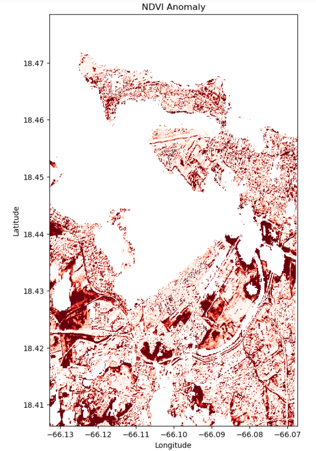
Analysis (Visualization 03)
The visualization highlights striking contrasts in vegetation health with dark red areas indicating substantial damage, likely due to strong winds and rain near the coastal area for urban and suburban neighborhoods. Paler reds suggest areas of moderate impact, with prospects for a more rapid recovery. The irregular pattern of damage implies that factors like terrain variability and proximity to urban structures influenced the level of impact. The insights call for targeted reconstruction and strategic planning for similar future events.
Part III. Object Detection and Model Building
Generating Training and Testing Data along with the Configuration File
#!labelme2yolo --json_dir /path/to/labelme_json_dir/
!labelme2yolo --json_dir "./labelme_json_dir/"
Model Building and Model Training
#Loading the model
model = YOLO('yolov8n.pt')

# Display model information (optional)
model.info()
YOLOv8n summary: 225 layers, 3157200 parameters, 0 gradients, 8.9 GFLOPs
(225, 3157200, 0, 8.8575488)
# Train the model on the dataset for 50 epochs
results = model.train(data   = "./datasets/dataset.yaml",
                      epochs = 50  ,
                      imgsz  = 512)
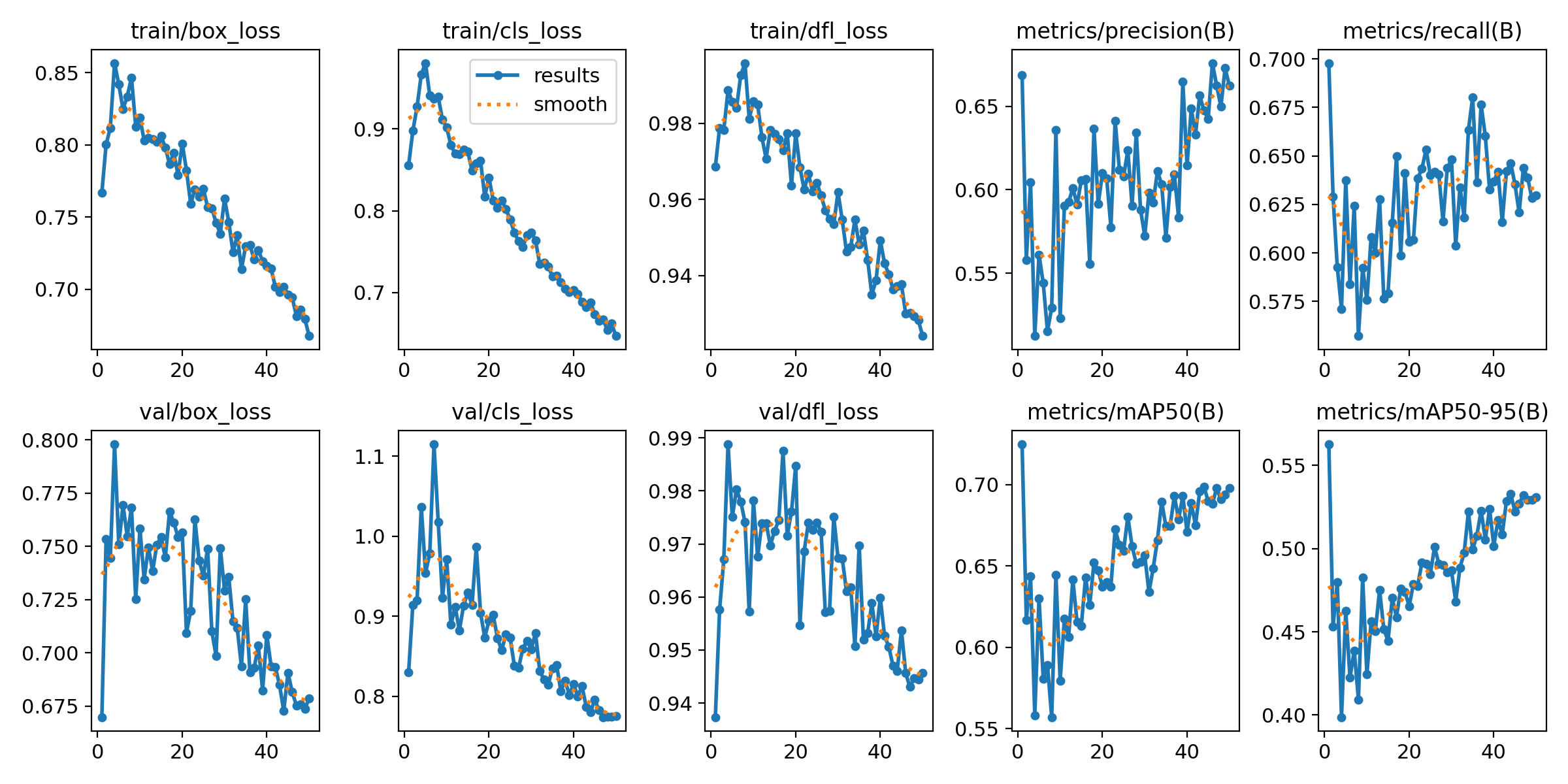
After 50 Epochs
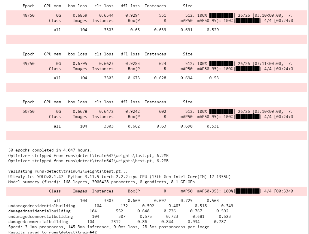
Model Evaluation
%matplotlib inline

figure(figsize=(15, 10), dpi=80)
# reading the image
results = img.imread('./runs/detect/train642/results.png')

# displaying the image
plt.imshow(results)
plt.show()
Part IV. Model Analysis
Confusion Matrix
figure(figsize=(20,15), dpi=80)

# reading the image
cf = img.imread('./runs/detect/train642/confusion_matrix.png')

# displaying the image
plt.imshow(cf)
plt.show()
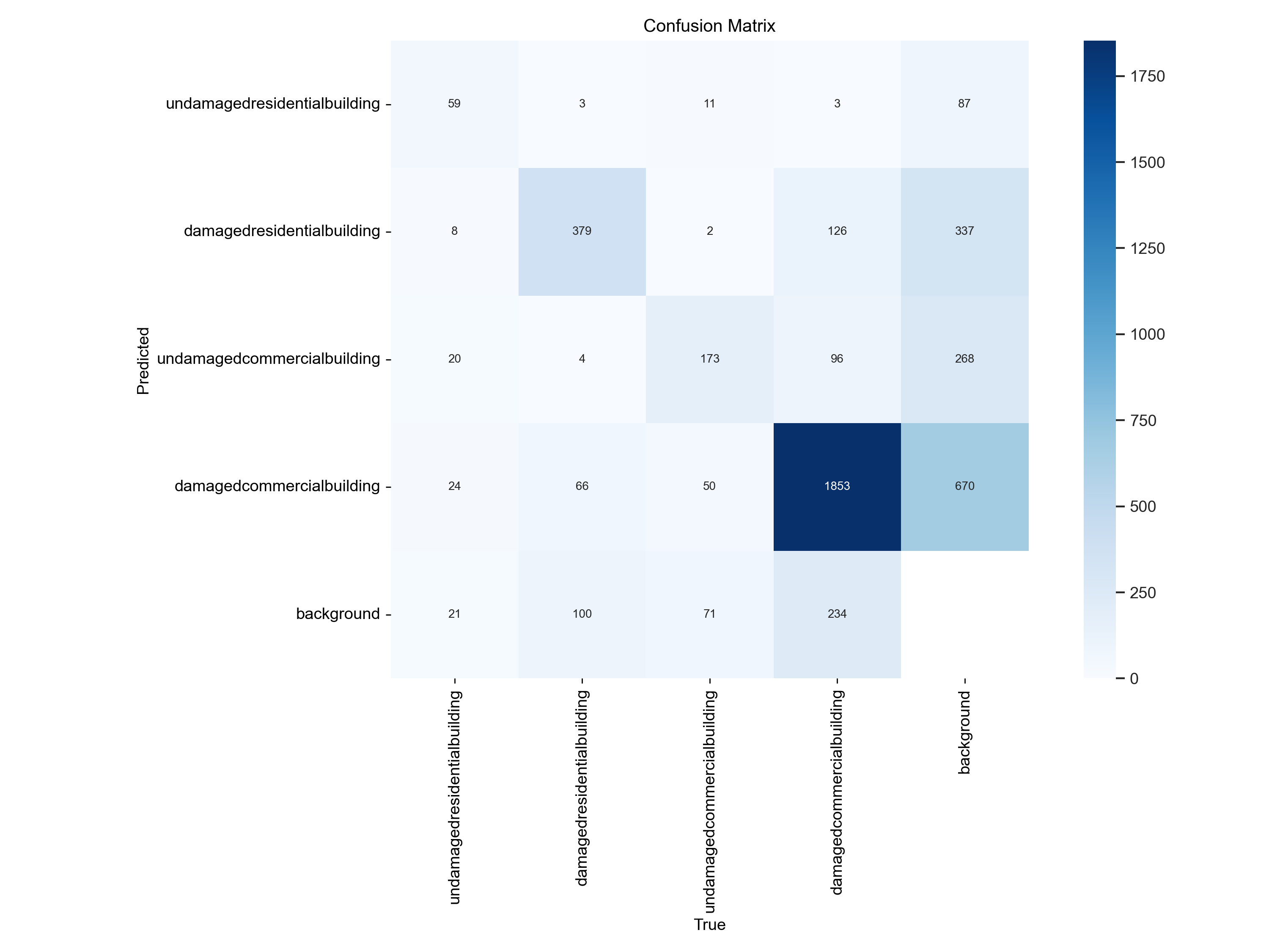
Converting Confusion Matrix for each Class
Class 1 Undamaged residential building
# Confusion Matrix for Class 1 (2x2)
confusion_matrix_one = np.array([[59, 104],
                                 [73, 4429]])

# Select rows and columns corresponding to class 1
class_index = 0
tp_1 = confusion_matrix_one[class_index, class_index]
fp_1 = confusion_matrix_one[:, class_index].sum() - tp_1
fn_1 = confusion_matrix_one[class_index, :].sum() - tp_1
tn_1 = confusion_matrix_one.sum() - tp_1 - fp_1 - fn_1

# Construct one-vs-all confusion matrix for class 1
class_one = np.array([[tp_1, fp_1],
                      [fn_1, tn_1]])

print("Confusion Matrix for Class 1 (undamaged residential building)")

# Unpacking the one-vs-all confusion matrix for Class 1
tn_1, fp_1, fn_1, tp_1 = tn_1, fp_1, fn_1, tp_1

# Printing each result one-by-one
print(f"""
True Positives: {tp_1}
False Positives: {fp_1}
True Negatives: {tn_1}
False Negatives: {fn_1}
""")

# Calculate precision and recall for Class 1 (undamaged residential building)
precision_1 = tp_1 / (tp_1 + fp_1)
recall_1 = tp_1 / (tp_1 + fn_1)

print(f"Precision for Class 1: {precision_1:.4f}")
print(f"Recall for Class 1: {recall_1:.4f}")
Confusion Matrix for Class 1 (undamaged residential building)
True Positives: 59
False Positives: 73
True Negatives: 4429
False Negatives: 104
Precision for Class 1: 0.4470
Recall for Class 1: 0.3620
Class 2 Damaged residential buildings
# Confusion Matrix for Class 2 (2x2)
confusion_matrix_two = np.array([[379, 473],
                                 [173, 3640]])

# Select rows and columns corresponding to class 2
class_index = 0
tp_2 = confusion_matrix_two[class_index, class_index]
fp_2 = confusion_matrix_two[:, class_index].sum() - tp_2
fn_2 = confusion_matrix_two[class_index, :].sum() - tp_2
tn_2 = confusion_matrix_two.sum() - tp_2 - fp_2 - fn_2

# Construct one-vs-all confusion matrix for class 2
class_two = np.array([[tp_2, fp_2],
                      [fn_2, tn_2]])

print("Confusion Matrix for Class 2 (damaged residential building)")

# Unpacking the one-vs-all confusion matrix for Class 2
tn_2, fp_2, fn_2, tp_2 = tn_2, fp_2, fn_2, tp_2

# Printing each result one-by-one
print(f"""
True Positives: {tp_2}
False Positives: {fp_2}
True Negatives: {tn_2}
False Negatives: {fn_2}
""")

# Calculate precision and recall for Class 2 (damaged residential buildings)
precision_2 = tp_2 / (tp_2 + fp_2)
recall_2 = tp_2 / (tp_2 + fn_2)

print(f"Precision for Class 2: {precision_2:.4f}")
print(f"Recall for Class 2: {recall_2:.4f}")
Confusion Matrix for Class 2 (damaged residential building)
True Positives: 379
False Positives: 173
True Negatives: 3640
False Negatives: 473
Precision for Class 2: 0.6866
Recall for Class 2: 0.4448
Class 3 Undamaged commercial building
# Confusion Matrix for Class 3 (2x2)
confusion_matrix_three = np.array([[173, 388],
                                   [134, 3970]])

# Select rows and columns corresponding to class 3
class_index = 0
tp_3 = confusion_matrix_three[class_index, class_index]
fp_3 = confusion_matrix_three[:, class_index].sum() - tp_3
fn_3 = confusion_matrix_three[class_index, :].sum() - tp_3
tn_3 = confusion_matrix_three.sum() - tp_3 - fp_3 - fn_3

# Construct one-vs-all confusion matrix for class 3
class_three = np.array([[tp_3, fp_3],
                        [fn_3, tn_3]])

print("Confusion Matrix for Class 3 (undamaged commercial building)")

# Unpacking the one-vs-all confusion matrix for Class 3
tn_3, fp_3, fn_3, tp_3 = tn_3, fp_3, fn_3, tp_3

# Printing each result one-by-one
print(f"""
True Positives: {tp_3}
False Positives: {fp_3}
True Negatives: {tn_3}
False Negatives: {fn_3}
""")

# Calculate precision and recall for Class 3
precision_3 = tp_3 / (tp_3 + fp_3)
recall_3 = tp_3 / (tp_3 + fn_3)

print(f"Precision for Class 3: {precision_3:.4f}")
print(f"Recall for Class 3: {recall_3:.4f}")
Confusion Matrix for Class 3 (undamaged commercial building)
True Positives: 173
False Positives: 134
True Negatives: 3970
False Negatives: 388
Precision for Class 3: 0.5635
Recall for Class 3: 0.3084
Class 4 Damaged commercial building
# Confusion Matrix for Class 4 (2x2)
confusion_matrix_four = np.array([[1853, 810],
                                  [459, 1543]])

# Select rows and columns corresponding to class 4
class_index = 0
tp_4 = confusion_matrix_four[class_index, class_index]
fp_4 = confusion_matrix_four[:, class_index].sum() - tp_4
fn_4 = confusion_matrix_four[class_index, :].sum() - tp_4
tn_4 = confusion_matrix_four.sum() - tp_4 - fp_4 - fn_4

# Construct one-vs-all confusion matrix for class 4
class_four = np.array([[tp_4, fp_4],
                       [fn_4, tn_4]])

print("Confusion Matrix for Class 4 (damaged commercial building)")

# Unpacking the one-vs-all confusion matrix for Class 4
tn_4, fp_4, fn_4, tp_4 = tn_4, fp_4, fn_4, tp_4

# Printing each result one-by-one
print(f"""
True Positives: {tp_4}
False Positives: {fp_4}
True Negatives: {tn_4}
False Negatives: {fn_4}
""")

# Calculate precision and recall for Class 4
precision_4 = tp_4 / (tp_4 + fp_4)
recall_4 = tp_4 / (tp_4 + fn_4)

print(f"Precision for Class 4: {precision_4:.4f}")
print(f"Recall for Class 4: {recall_4:.4f}")
Confusion Matrix for Class 4 (damaged commercial building)
True Positives: 1853
False Positives: 459
True Negatives: 1543
False Negatives: 810
Precision for Class 4: 0.8015
Recall for Class 4: 0.6958
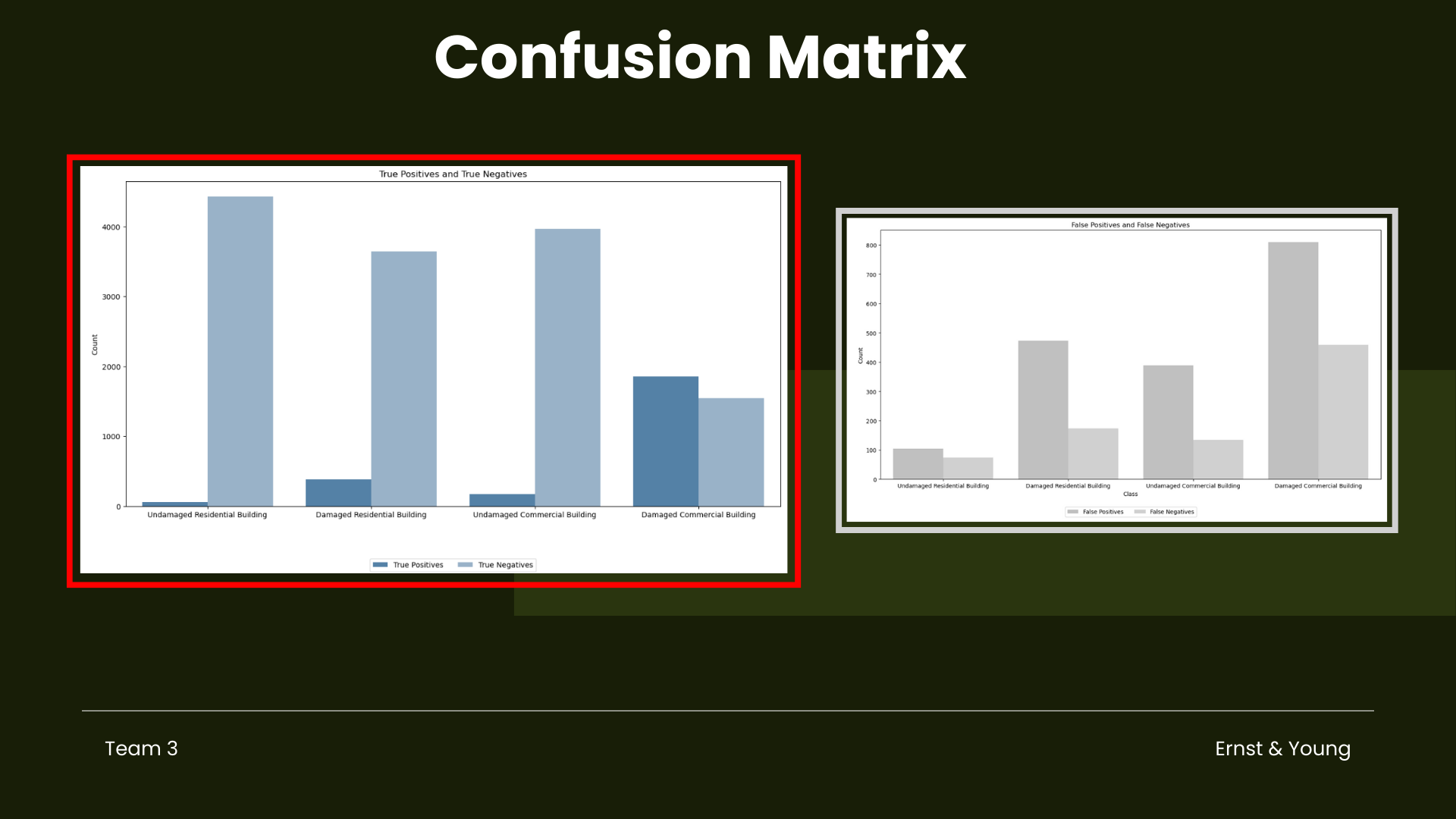
# Confusion matrix values for each class
cm_values = {
    'Undamaged Residential Building': [59, 104, 73, 4429],
    'Damaged Residential Building': [379, 473, 173, 3640],
    'Undamaged Commercial Building': [173, 388, 134, 3970],
    'Damaged Commercial Building': [1853, 810, 459, 1543]
}

# Extract true positives, false positives, false negatives, and true negatives for each class
true_positives = []
false_positives = []
false_negatives = []
true_negatives = []

for class_name, values in cm_values.items():
    tp, fp, fn, tn = values
    true_positives.append(tp)
    false_positives.append(fp)
    false_negatives.append(fn)
    true_negatives.append(tn)

# Create a DataFrame for plotting
data = pd.DataFrame({
    'Class': list(cm_values.keys()),
    'True Positives': true_positives,
    'False Positives': false_positives,
    'False Negatives': false_negatives,
    'True Negatives': true_negatives
})

# Melt the DataFrame for easier plotting
data_melted = data.melt(id_vars='Class', var_name='Metric', value_name='Count')

# Set the figure size
plt.figure(figsize=(16, 8))

# Create custom palettes for True Positives (dark blue) and False Positives/Negatives/True Negatives (grey)
blue_palette = sns.light_palette("steelblue", as_cmap=False, reverse=True, n_colors=10)
grey_palette = sns.light_palette("grey", as_cmap=False, reverse=True, n_colors=8)

# Create the bar plot for True Positives and True Negatives
sns.barplot(data=data_melted[data_melted['Metric'].isin(['True Positives', 'True Negatives'])],
            x='Class', y='Count', hue='Metric', palette=[blue_palette[0], blue_palette[4]])
plt.title('True Positives and True Negatives')
plt.xlabel('')
plt.ylabel('Count')
plt.legend(loc='upper center', bbox_to_anchor=(0.5, -0.15), ncol=2)
plt.show()

# Create the bar plot for False Positives and False Negatives
plt.figure(figsize=(16, 8))
sns.barplot(data=data_melted[data_melted['Metric'].isin(['False Positives', 'False Negatives'])],
            x='Class', y='Count', hue='Metric', palette=[grey_palette[4], grey_palette[5]])
plt.title('False Positives and False Negatives')
plt.xlabel('Class')
plt.ylabel('Count')
plt.legend(loc='upper center', bbox_to_anchor=(0.5, -0.1), ncol=2)
plt.show()
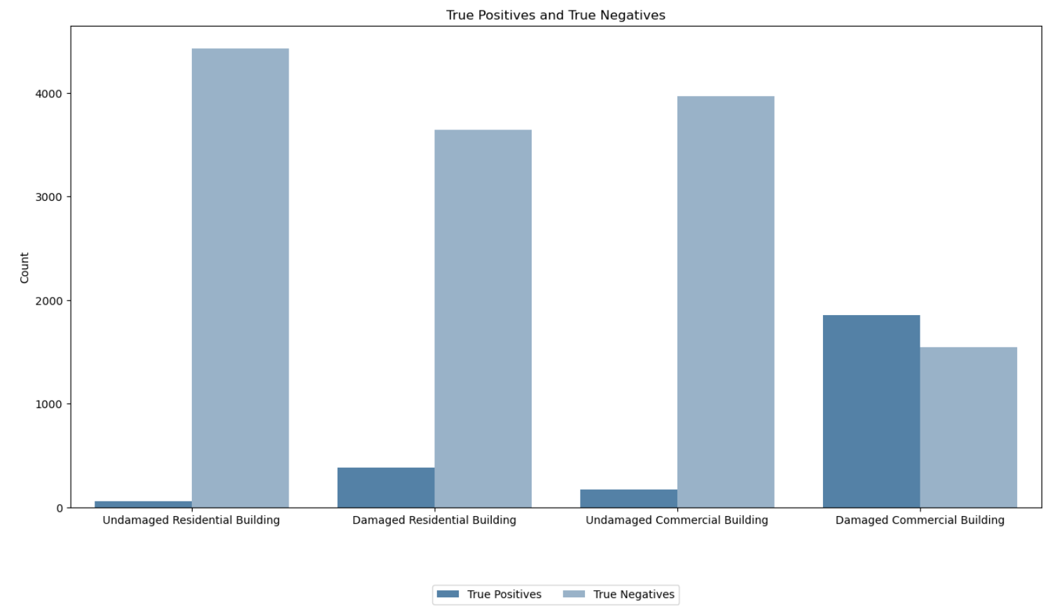
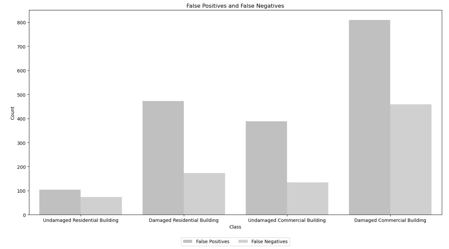
Confusion Matrix Analysis
Undamaged vs. Damaged Commercial Buildings
Between undamaged and damaged commercial buildings, the model shows a notable difference in performance. It exhibits higher precision and recall for identifying damaged commercial buildings compared to undamaged ones. This indicates that model is more adept at correctly classifying damaged commercial buildings while minimizing false positives and false negatives in this category.
Undamaged vs. Damaged Residential Buildings
Similarly, when comparing undamaged and damaged residential buildings, the model demonstrates a similar trend. It performs better in correctly identifying damaged residential buildings, with higher precision and recall scores, suggesting that it is more reliable in distinguishing these structures from undamaged ones.
Overall, the model shows a trend of higher performance in identifying damaged buildings across both residential and commercial categories, with varying levels of precision and recall for each class.
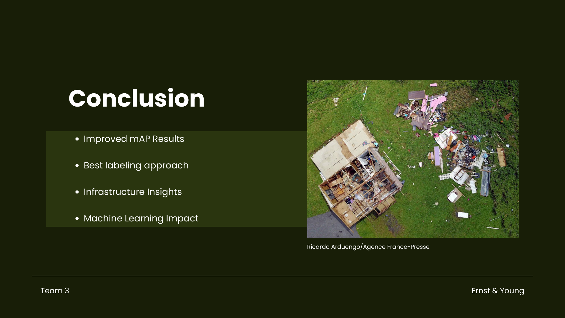
Part V. Conclusion
Our team labeled 60 images for both pre- and post-storm scenarios, achieving an mAP of around 0.50. Additionally, we leveraged Open Source Roboflow datasets, which use auto labeling, with the same images. We tried three different labeling approaches and concluded that manual labeling using polygons that outline the shape of the building without background elements yielded highest results compared to using fixed rectangles. Labeling commercial buildings is identifiable since we considered big parking spaces and flat roofings, while for residential buildings, it tends to appear smaller and with a ridge line in roofing.
Given more time, we could explore hybrid approaches of using polygons and fixed rectangles with overlapping, similar to how Roboflow labeled it. This is for further analysis, as our model performance improved after using open-source datasets from Roboflow.
Model results offer insights to NASA, Ernst and Young, and infrastructure sectors, enhancing disaster response using machine learning and deep learning with Sentinel-2 data, promoting resilient communities.
Steps your team would implement/improve if you were given three months to work on this project
Continuously improving the object detection model possibly by using more advanced models for accurate labeling and prediction. Also, considering the size of the buildings, among other features, may enhance its ability to classify damaged and undamaged buildings accurately, leading to better results. Additionally, QGIS offers tools for spatial analysis and feature extraction, allowing for further refinement of object detection algorithms based on building characteristics such as size, shape, and spatial arrangement. Applying advanced pre-processing techniques (sharpening, noise reduction) to improve image clarity. Finally, employing a hybrid approach in manual labeling and using auto-labeling tools to compare results could be beneficial.
Part VI. Feedback to EY
Scale Variation
One of the challenges the team encountered with the satellite images was scale variation. The images, which have a large field of view and are often taken from a top-down perspective, vary significantly in angle and viewpoint. This leads to differences in the scale of objects within each image and class. Additionally, the uniform cropping of the images introduces more background noise and partial cropping of some classes.
Part VII. References
Bane, B. (2021, September 22). Artificial Intelligence brings better hurricane predictions. Pacific Northwest National Laboratory. https://www.pnnl.gov/news-media/artificial-intelligence-brings-better-hurricane-predictions

FEMA. March 2022. Hurricane and Flood Mitigation Handbook for Public Facilities. https://www.fema.gov/sites/default/files/documents/fema_p-2181-fact-sheet-5-4-shorelines.pdf

Find Codes. (n.d.). Codes.iccsafe.org. https://codes.iccsafe.org/codes/puerto-rico

Grabmeier, J. (2022, October 6). New machine learning model can provide more accurate assessments of hurricane damage for responders. The Ohio State University. https://techxplore.com/news/2022-10-machine-accurate-hurricane.html

Hosannah, N., Ramamurthy, P., Marti, J., Munoz, J., & González, J. E. (2021). Impacts of Hurricane Maria on land and convection modification over Puerto Rico. Journal of Geophysical Research: Atmospheres, 126, e2020JD032493. https://doi. org/10.1029/2020JD032493

Hurricane Preparedness and Response - Preparedness | Occupational Safety and Health Administration. (n.d.). www.osha.gov. https://www.osha.gov/hurricane/preparedness

Kundu, R. (2022, August 3). Image Processing: Techniques, Types & Applications [2023]. https://www.v7labs.com/blog/image-processing-guide

Li, C. (2020). Object detection in aerial image. Unc Charlotte Electronic Theses And Dissertations.

Maayan, G. (2023, September 12). Complete Guide to Image Labeling for Computer Vision. Comet. https://www.comet.com/site/blog/complete-guide-to-image-labeling-for-computer-vision/

Microsoft Planetary Computer. Landsat Collection 2 Level-2. https://planetarycomputer.microsoft.com/dataset/landsat-c2-l2

Microsoft Planetary Computer. Sentinel-2 Level-2A. https://planetarycomputer.microsoft.com/dataset/sentinel-2-l2a

NASA (July 2019). NASA Surveys Hurricane Damage to Puerto Rico's Forests (Data Viz Version). https://svs.gsfc.nasa.gov/4735/

PBS Org (March, 2019). Hurricane Maria Devastated Puerto Rico’s Forests at an Unprecedented Rate. https://www.pbs.org/wgbh/nova/article/hurricane-maria-devastated-puerto-ricos-forests-at-an-unprecedented-rate/

Pérez Valentín, J. M., & Müller, M. F.(2020). Impact of Hurricane Maria onbeach erosion in Puerto Rico: Remotesensing and causal inference.Geophysical Research Letters,47,e2020GL087306. https://doi.org/10.1029/2020GL087306Received

Peter Sheng Y, Paramygin VA, Rivera-Nieves AA, Zou R, Fernald S, Hall T, Jacob K. Coastal marshes provide valuable protection for coastal communities from storm-induced wave, flood, and structural loss in a changing climate. Sci Rep. 2022 Feb 23;12(1):3051. doi: 10.1038/s41598-022-06850-z. PMID: 35197502; PMCID: PMC8866407.

Protective Actions Research. (2024). Fema.gov. https://community.fema.gov/ProtectiveActions/s/article/Hurricane-Review-Your-Insurance

Roboflow User (um). tes1 Image Dataset. https://universe.roboflow.com/um-w3o1a/tes1-mjea9/dataset/3. Retrieved 24Apr2023

Scott, M. (2018, August 1). Hurricane Maria’s devastation of Puerto Rico. https://www.climate.gov/news-features/understanding-climate/hurricane-marias-devastation-puerto-rico

Shorten, C., Khoshgoftaar, T.M. (2019, July 6). A survey on Image Data Augmentation for Deep Learning. J Big Data 6, 60 (2019). https://doi.org/10.1186/s40537-019-0197-0

USGS. Landsat Collection 2 Quality Assessment Bands. https://www.usgs.gov/landsat-missions/landsat-collection-2-quality-assessment-bands

Vishal Pandey, Khushboo Anand, Anmol Kalra, Anmol Gupta, Partha Pratim Roy, Byung-Gyu Kim. Enhancing object detection in aerial images[J]. Mathematical Biosciences and Engineering, 2022, 19(8): 7920-7932. doi: 10.3934/mbe.2022370

Wetlands International and The Nature Conservancy. Mangroves for coastal defence. https://www.nature.org/media/oceansandcoasts/mangroves-for-coastal-defence.pdf