

Sales Performance Analysis
Dashboard and Storyboard
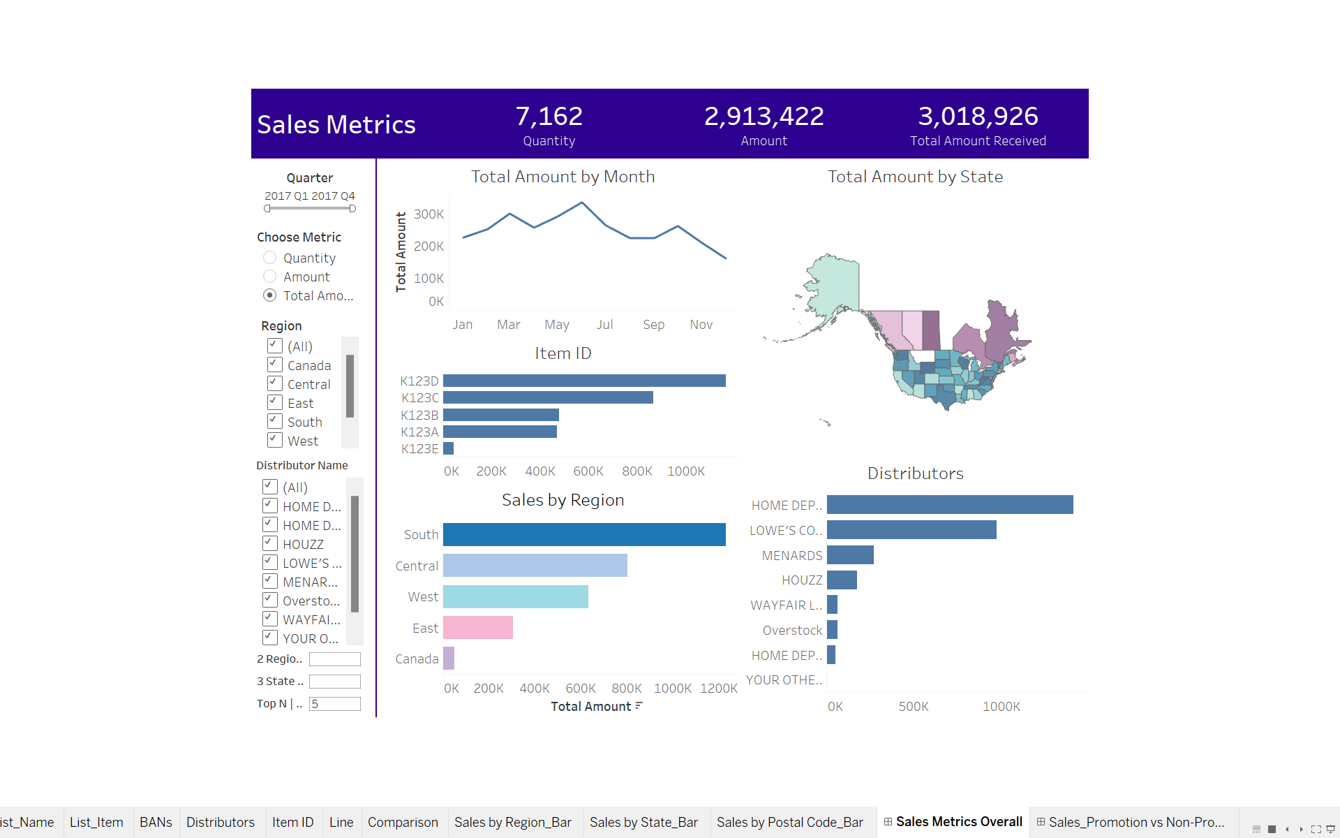
The dashboards used in the storyboard present a comprehensive view of sales performance, allowing users to analyze trends and make informed decisions. It includes key metrics such as total sales amounts and quantities per state, visualized through Big Numbers (BANs) and maps with dynamic zone visibility. The line chart shows sales trends over time, while the drill-down bar chart provides detailed insights into sales performance at different geographical levels. The dashboard utilizes Tableau essentials to enhance interactivity and effectiveness, catering to both technical and non-technical audiences.
Interactive Dashboard (Video)
Insights and Recommendations
Regional Sales Comparison
Focus on increasing sales efforts in high-performing regions like Ontario, Alberta,
Texas, and Florida.
Top Distributors and Items
Strengthen partnerships with top distributors like Home Depot and prioritize the
promotion of high-selling items.
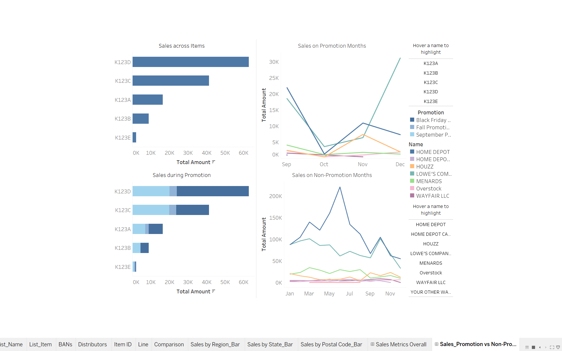
Comparison of Promotion Impact
Plan promotions to align with successful periods, such as November and
December, and monitor effectiveness to maximize impact.
Trends and Top Distributors
Analyze factors contributing to the success of Lowe’s Companies Incorporated and
consider replicating strategies in other regions.
Type of Promotion
Leverage the popularity of Black Friday and the September Promotion by optimizing marketing
efforts and product offerings during these periods.
Storytelling and Conclusions
The storyboard and dashboard tell a compelling story of sales performance, highlighting key insights and trends. By
starting with an overview of regional sales and top distributors, the audience gets a clear picture and snapshot of where
sales are strongest. The comparison of promotional and non-promotional periods also reveals the impact of marketing
strategies on sales.
The use of dynamic visualizations, such as the drill-down bar chart, allows users to explore the data interactively,
gaining deeper insights into sales performance at various levels. This interactivity engages users and helps them
understand the data more effectively.
Users can change the dashboard’s displayed information by selecting a state on the map. When a state is selected, the
BANs, item ID/products, and distributor or company names associated with that state will update accordingly. This
feature allows users to interactively explore data at different levels of granularity. By selecting a state, users can drill
down to view detailed information specific to that state, such as the sales performance of different products or the
distribution network in that area.
The line chart is designed to adapt dynamically to the user’s preferences, allowing them to view Key Performance
Indicators (KPIs) by month. This flexibility extends to interactions with other visualizations, such as the map or BANs,
where changes made in one visualization can affect the others. Similarly, the line chart can also be influenced by the
user, resulting in updates to other visualizations and BANs within the dashboard.
Based on the analysis, it is clear that strategic decisions can significantly impact sales performance. By focusing on high-performing regions and distributors, and leveraging successful promotion periods, businesses can optimize their marketing efforts and drive growth. Additionally, understanding the trends and top-performing items can guide product development and inventory management strategies. In conclusion, the dashboard provides valuable insights that can inform decision-making and drive business success. By utilizing the storytelling skills and interactive features of Tableau, businesses can gain a competitive edge and achieve their sales goals.